
We stopped by the paint selection this week and I thought I'd found the perfect pantry color.

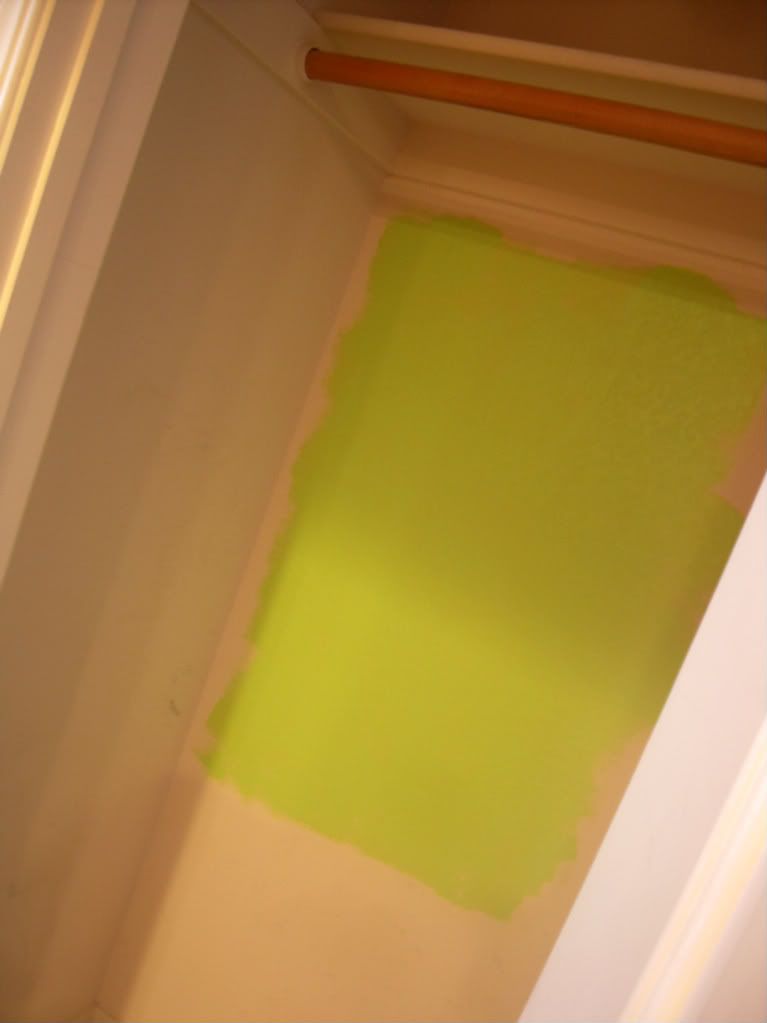
"Hidden Meadow"...the second from the top. Thought it was going to be a lighter apple/pear green color. W was actually worried it might be too dark for the unlit space. Well, there's nothing "hidden" or dark about it, it is literally NEON GREEN. I'm not kidding. I knew there were yellow undertones, but seriously, it looks like a bright tropical tree frog green. And our pantry is fairly dark...there's no lighting around it or in it. The sad thing is I knew exactly when I took the quart from the lady who mixed it. That small little sample dot gave it away and I cringed as I walked over to check out.
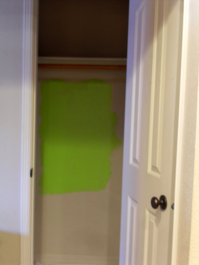
Getting home and after putting E down for his nap, I busted it open just to prove what I already knew: complete color fail.
Lessons Learned:
1) I'm not a Color Queen, I've just been lucky up until this point and still have a lot to learn
2) Don't be afraid to get walk out with just a $2 sample...even if that means going back again and again to the store.
On to another green hue family that's a bit more toned down and back to the store to buy some samples. I can't take looking at this highlighter green any longer. :/
Please tell me I'm not the only one who's had poor color luck?!
Please tell me I'm not the only one who's had poor color luck?!
4 comments:
this happened when we painted our bedroom yellow. we went through (if i remember correctly) nine different samples, because they all looked like we colored our wall in highlighter. they were so neon!! ugh, i cringe at the drama we went thru! we still arent completely happy with what we ended up with, so we are actually changing complete directions and repainting to a grey/bluish type of tone this weekend...
the boy's bathroom is a great green color, if you ever want to swing by and take a look....it reminds me of the pear description you gave. it is light and fresh, yet bright and dominant. we really love it. (and went thru A LOT of greens to find it). let me know, you're welcome to swing by anytime!!
Haha! I hate when this happens. I'm leaning towards doing green in our new kitchen and I'm tempted to go with a light, but bright shade. This one you have here is too dark and bright for me, but I think its fun for a closet :)
Jason's sister once painted her bedroom construction sign orange. His parents entire hallway looked like it was sunburned :)
I once bought bright pink mini-blinds (yes I know, but they were VERY fashionable back then) for my home office. I had blue wallpaper (yeah, that was popular too) with just a touch of pink and the contrast would be great while popping up that little bit of pink. Well, I was so pleased with how that room looked...until I was driving home the next day and saw the bright pink mini-blinds showing through the window on the front of the house! It was a neon pink clashing with the bright yellow house! I NEVER even thought about what it would look like outside of the room....or that it would show outside of the house! Lesson learned.
Ugh I have the same problem with the same exact color. I already put the first coat on a dresser I spent hours prepping. I was hoping it would dry darker. I'm going to attempt to darken it myself by adding a few drops of brown. We'll see how it goes!
Post a Comment